User Interface Design
Redesigning HDB mobile app experience
How might we build an integrated and intuitive interface within the Mobile@HDB app that brings together key services for a more efficient user experience?
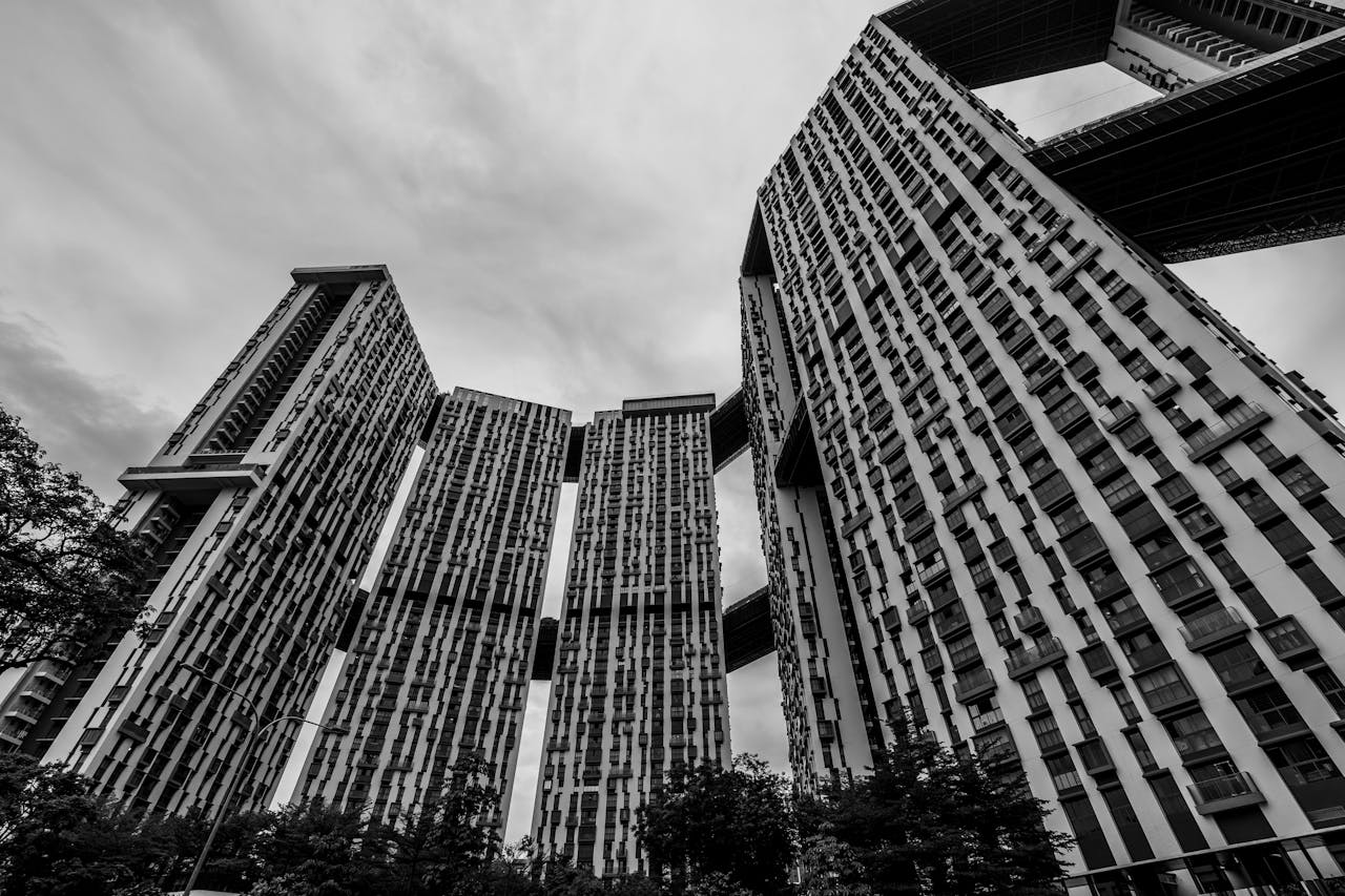
The Housing & Development Board (HDB), established on 1 February 1960, is Singapore’s public housing authority responsible for planning and developing residential estates. Initially formed to address the housing crisis and replace unsanitary slums, HDB has since built over 1 million flats across 24 towns and 3 estates, providing homes for 80% of Singapore’s residents, with 90% of them owning their homes.
Beyond housing, HDB offers essential commercial, recreational, and social amenities, contributing to the development of vibrant, sustainable communities for over 50 years.
The Mobile@HDB app consolidates essential HDB services and information into a single, accessible platform, making it easier for users to stay informed and complete tasks related to public housing.
Key features include:
- Checking Sales Application Results: Monitor BTO flats available for selection, probable completion dates, and application statuses.
- Exploring Resale Flat Information: Access recent transacted prices and ethnic quotas for resale flats in your preferred locations.
- Locating HDB Offices: Find directions to HDB Hub, Branches, and Service Centres effortlessly.
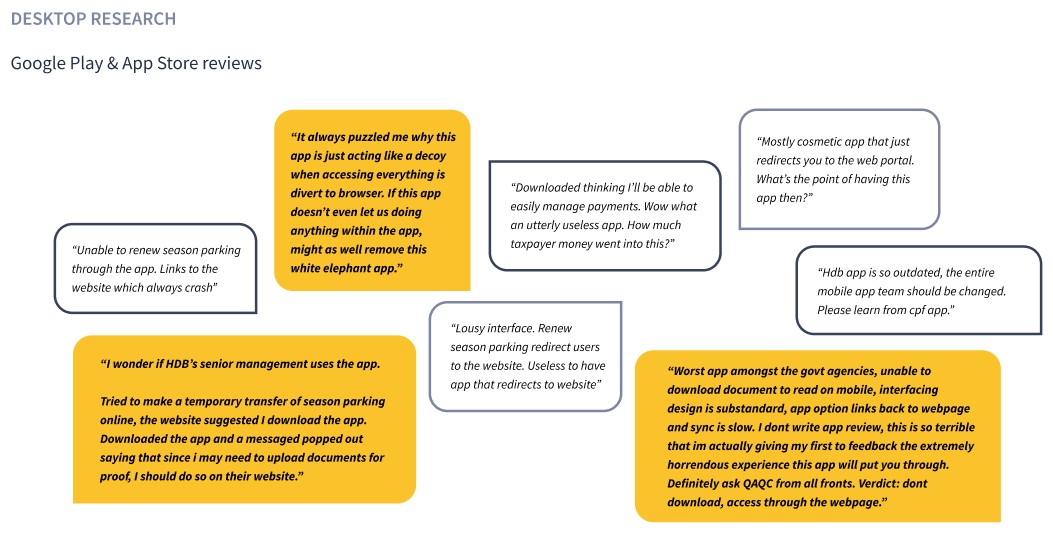
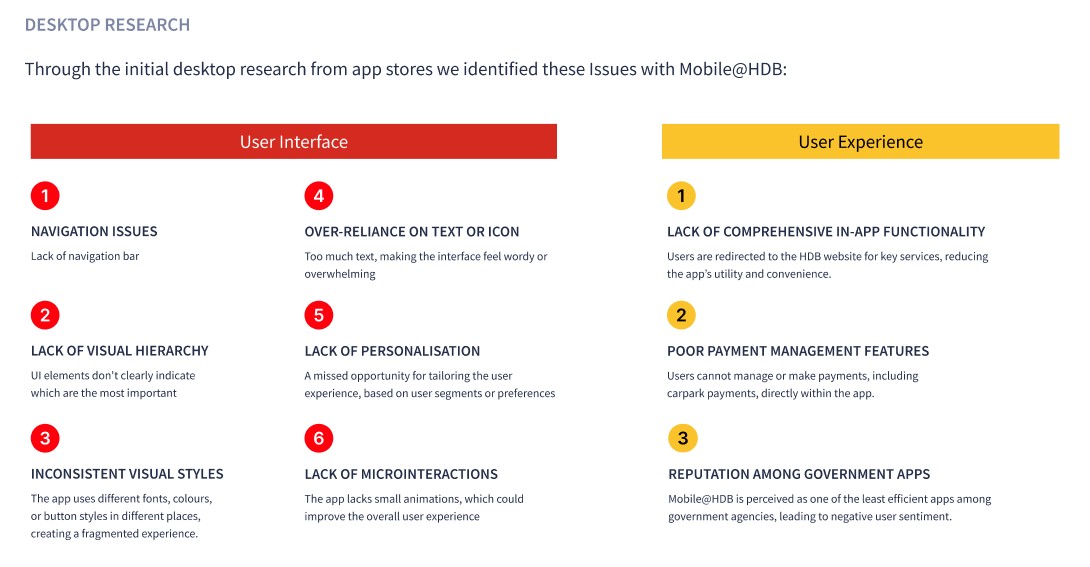
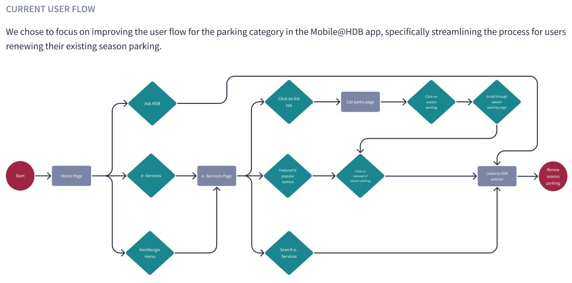
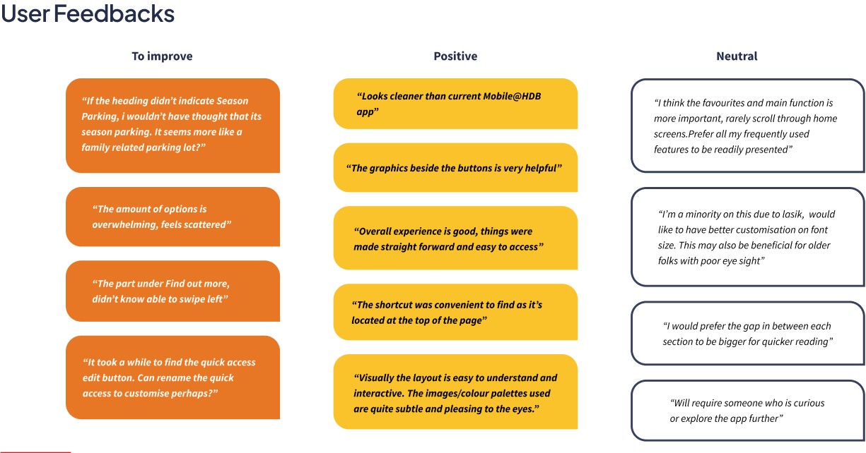
UX Audit


“How might we build an integrated and intuitive interface within the Mobile@HDB app that brings together key services for a more efficient user experience?“
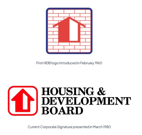
The current logo with HDB’s signature red and black represents the well-planned townships and well-designed homes where HDB residents live, work, and play. HDB towns are also where families are raised, and a close-knit, inclusive, and harmonious community is cultivated.
Inspired by the original logo, we reintroduced ‘blue’ with a twist of modernness into our revamped user interface design.
Branding
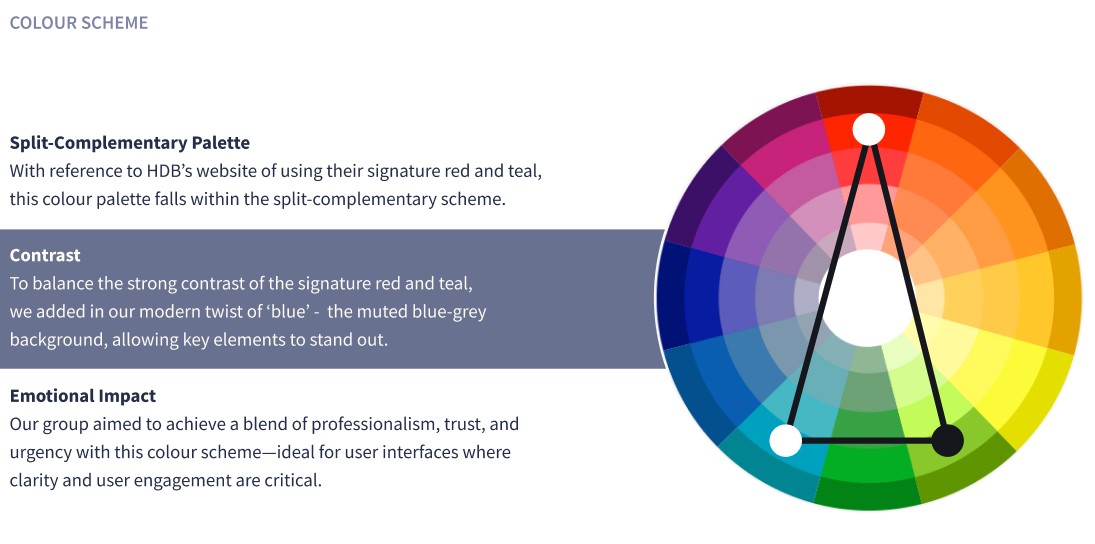
(60%) Neutral tone
A cool, muted blue-grey has been added to the palette for a calm, professional look with a touch of peace and sophistication. It’s perfect for modern, neutral designs and works well for text and buttons that need a subtle, refined touch.
(30%) Secondary tone
A deep, rich red with a hint of pink, similar to crimson or ruby. Inspired by HDB’s logo colour, it’s bold and attention-grabbing, conveying passion and energy without the urgency of bright red.
(10%) Accent tone
A deep teal with green undertones, blending blue and green for a calming yet vibrant look. Teal is linked to calmness, trust, and balance, making it perfect for professional, modern designs where it adds stability and harmony as an accent colour.

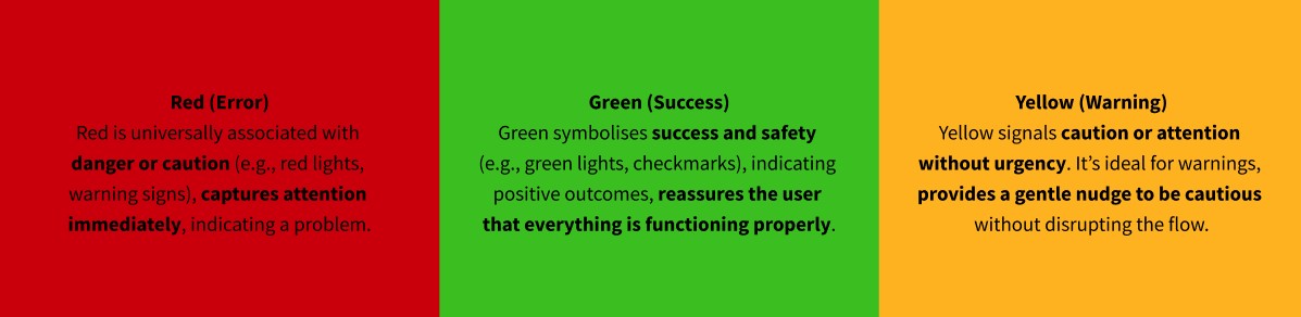
Our utility colours align with industry standards – creating a familiar, intuitive experience. Users instinctively understand these colours based on prior digital experiences, reducing cognitive load and allowing for quick, effortless interpretation of system states.
Typography
Poppins
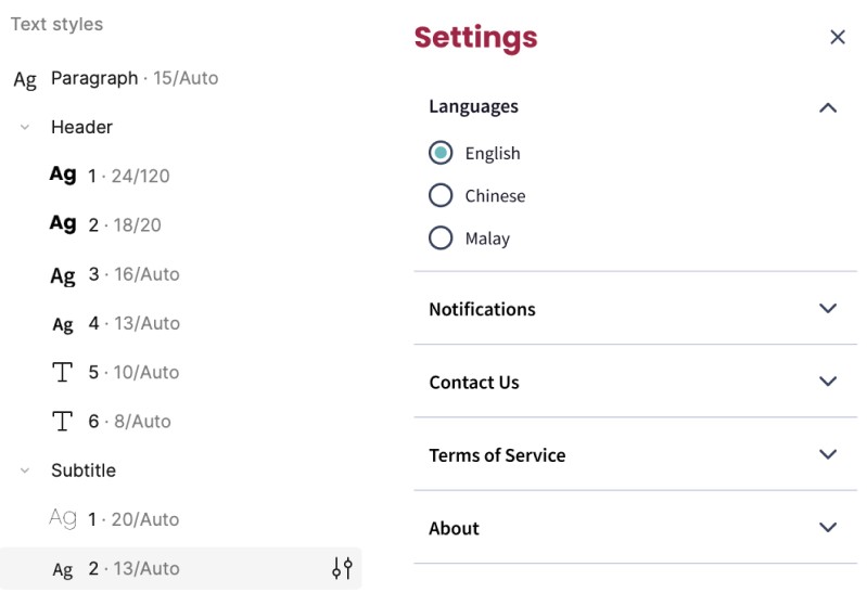
We chose Poppins for its clean, geometric sans-serif style and modern appeal, making it perfect for headings and titles that grab attention effectively.
Source Sans Pro
We selected Source Sans Pro for its exceptional readability, designed for clarity in body text, ensuring content is accessible and easy to follow.
This combination, together with our text styles, creates a clear visual hierarchy, with Poppins drawing attention and Source Sans Pro ensuring readability, resulting in a user-friendly and visually cohesive app design.
Icongraphy
As a team, we see icons as essential visual symbols that communicate actions, content, or concepts in a compact and easily recognisable way.
Why Icons Matter
We identified that icons improve navigation, enhance usability, and elevate the visual appeal of the interface. They also support accessibility when paired with appropriate labels.
Outline vs. Filled Icons
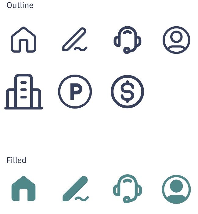
Outline Icons: We decided on using thin, minimal outline icons for actionable features. Their simplicity ensures a clean look, even when placed closely together.
Filled Icons: For selected or activated features, we chose solid, filled icons. These provide clear visual feedback, helping users understand their interactions at a glance.
Art direction
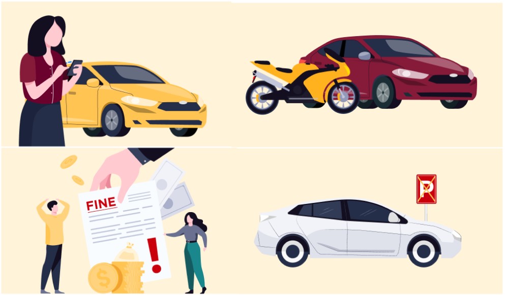
Illustrations were chosen over images for their flexibility and ability to create a visually rich, engaging, and intuitive user experience.
Benefits of using Illustrations
- Cohesive Design: Ensures a consistent, unique, and professional style.
- Enhanced Engagement: Makes the interface approachable and emotionally engaging.
- Improved Clarity: Breaks up text-heavy content and provides clear visual cues.
This choice ensures the app remains visually cohesive, user-friendly.
Components
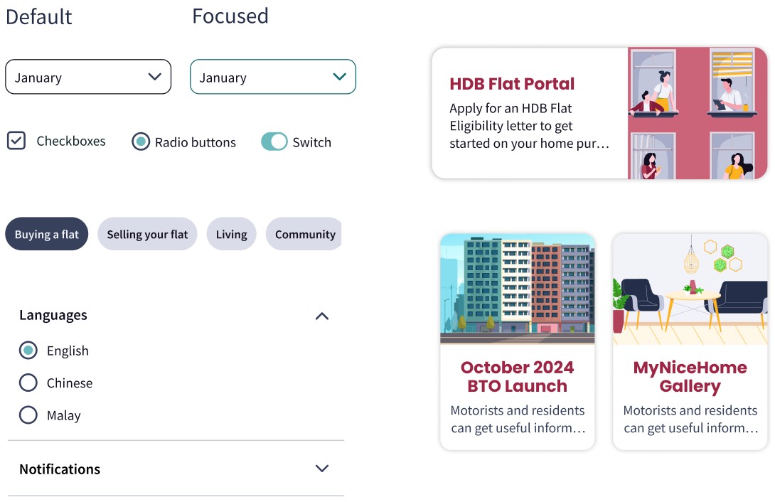
The use of components helps create consistent, modular, and interactive designs, improving the overall user interface and user experience.
Introducing of Components
- Chips: Showcases the various category, allowing users to interact with them.
- Accordion: Provide users with a way to view detailed information without too much scrolling or cognitive overloading.
- Checkbox: To give users the flexibility for multiple selections.
- Radio buttons: It simplifies decision-making by making it clear that only one selection is allowed.
Wireframe and Prototype
Usability Testing